- 首页
- International
- 艾特奖
- 文化节
- 服务体系
-
网站导航
项目名称:广东省汕头市凡舍设计事务所
Project Name: Fanshe design office, Shantou City, Guangdong Province
项目地址:广东省汕头市潮阳区棉北中信华庭商业中心2栋首层3号
Project Address: No. 3, No. 2 First Building, Huating Commercial Center, CITIC, Mianbei, Chaoyang District, Shantou City, Guangdong Province
项目面积:60平方米
Project area: 60 square meters
室内设计:凡舍建筑工程设计有限公司(凡舍设计)
Interior Design: Fanshe Architectural Engineering Design Co., Ltd. (Fanshe Design)
室内设计主创:张润/张帆
Indoor Design initiative: Zhang Run / Zhang Fan
主要建材:艺术漆,仿古瓷砖,烤漆
Major Building Materials: Art paint, antique tile, baking paint
设计时间:2019.03
Design time: 2019.03

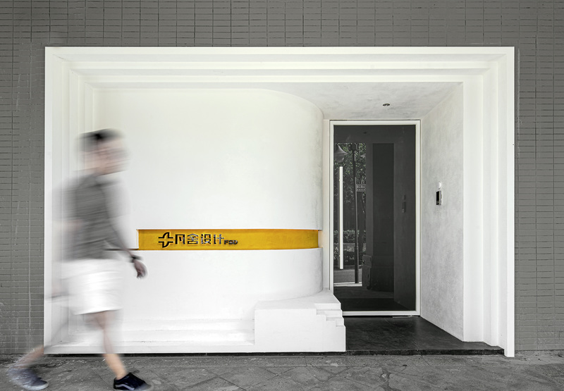
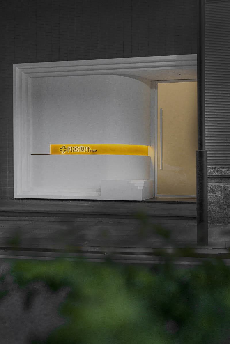
▼ Doorhead area,门头区域 作为凡舍设计办公空间,设计师希望用最简洁的设计手法来体现办公空间的干净,赋予空间最质朴的办公氛围。 As the office space designed by fanshe, the designer hopes to use the most concise design method to reflect the cleanness of the office space and endow the space with the most simple office atmosphere.

普遍的公司往往会把标识设置在门头的正上方,显得比较显眼。但凡舍门头恰恰相反,运用大面积留白来凸显精致的LOGO和名称标识。 Common companies tend to set the logo directly above the door, which is more conspicuous. On the contrary, the use of large areas of white to highlight the delicate logo and name logo.

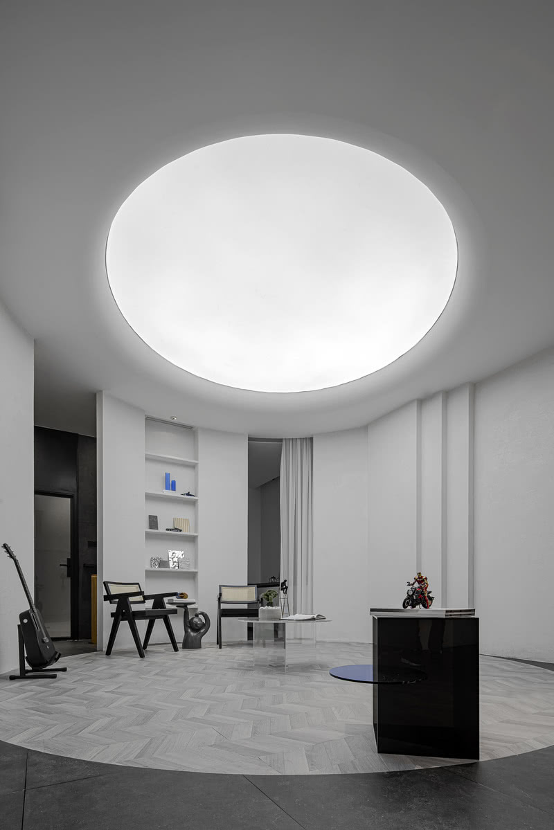
▼ Negotiation area,洽谈区域 由于空间本身采光不足,洽谈区天花采用了建筑的采光井手法,大胆地用一块灯箱膜的形式来营造一种采光井的意境,同时圆形的灯箱会使洽谈区的气氛更凝聚,代表了理智和静谧。 Due to the lack of lighting in the space itself, the ceiling of the negotiation area adopts the architectural lighting well technique, and boldly uses a light box membrane to create a mood of lighting well. At the same time, the round light box will make the atmosphere of the negotiation area more cohesive, representing the rationality and tranquility.